

Decorative Tiles: The Psychology of Colour
When choosing the perfect interior design style for your home, colour choices aren’t something to be taken lightly. While bold black may make a serious impact, it can often create the illusion of a smaller space. In contrast, bright white wall or floor tiles are a fantastic choice if you want to reflect light and let the furniture to do the talking, but are often accused of being too clinical for everyday living spaces. So which colour should you choose for your decor?
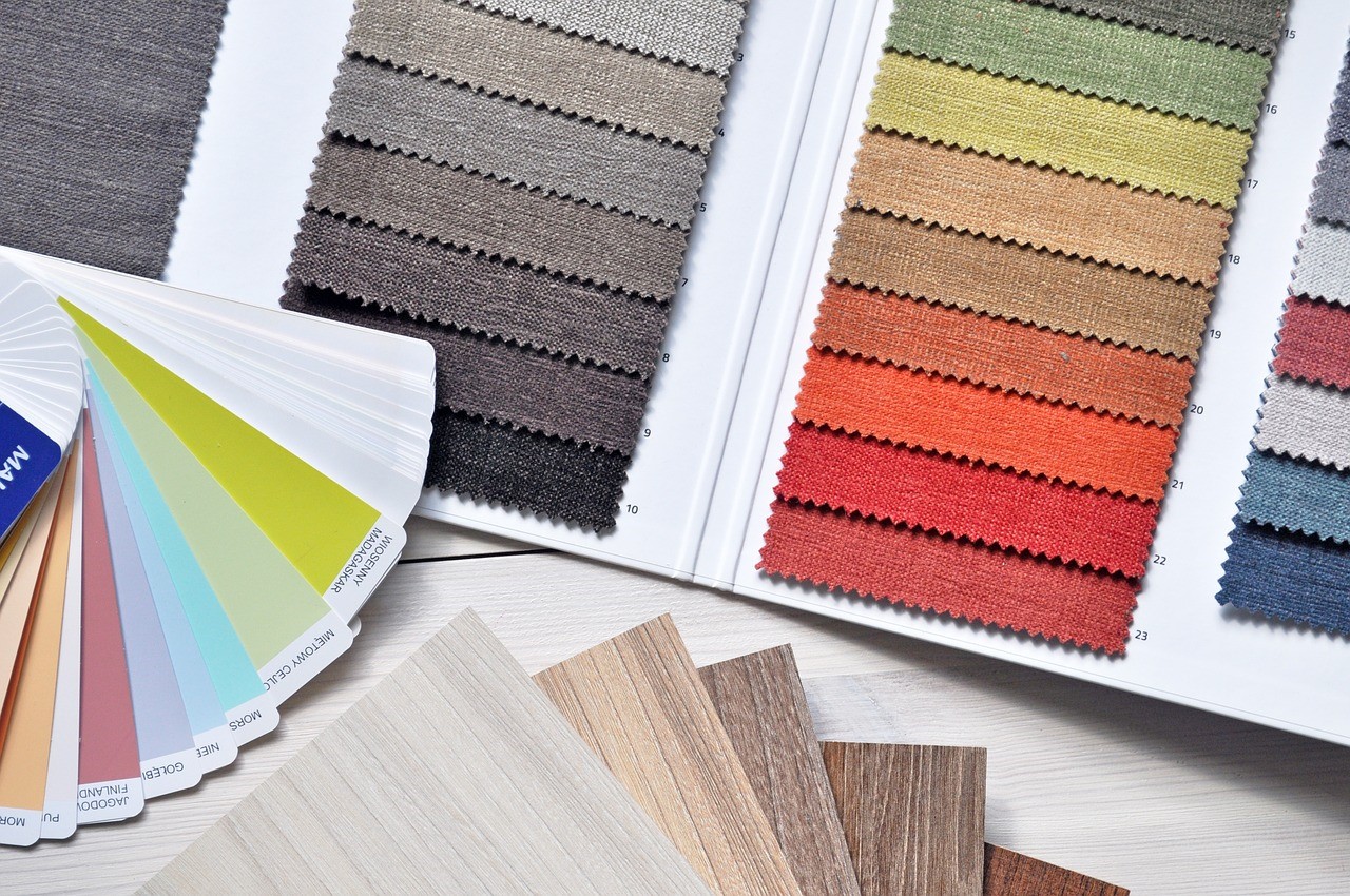
It’s a popular belief amongst psychologists that colour can have a major impact on our mood, and the tone of a room can be transformed with a simple splash of colour. Decorative tiles aren’t limited to patterns and textures, with vibrant and bold colours offering you the opportunity to create calm or excitement in any space. In today’s blog post, we’re taking a look at the meaning behind each colour, so you can decorate your home to truly reflect your personality and mood.
Orange
This warm colour symbolises stability, so it’s no surprise that when we see orange we instantly feel at home. Prevent insomnia by splashing the walls in orange outside of the bedroom. Oranges suit the Moroccan look perfectly, so combine this shade with rich reds and deep blues for an authentic Moorish feel.
Yellow
Whether you opt for a vibrant tint or mellow yellow, this is the colour of sunshine. Eye-catching and full of energy, it’s hard to take your eyes off decor that’s doused in yellow. In a kitchen, we love the idea of glossy yellow cabinet doors alongside a calming splashback of Toronto Antracite tiles.
Red

Associated with urgency and danger, red is only for the boldest risk-takers. Red signifies an element of energy and passion – making it a fantastic choice for a home that’s packed with love. Red may be brave, but time after time the gamble pays off and red provides a solid basis for a beautiful home. For a vibrant interior, add a pop of colour with red wall tiles and match with black and white geometric prints on the floor.
Green
Natural greens symbolise serenity, growth and the harmony of nature – making it a popular choice for living rooms and bedrooms. Olive and the paler green tones compliment wooden furniture and flooring perfectly – so for a restful refuge, treat your bedroom to a coat of green. We love the idea of seamlessly connecting the interior of the room to the great outdoors; so if your property is in a more rural location, invite nature indoors with encaustic green H Line floor tiles.
Black
Black signifies both luxury and mystery, making it an ideal choice for the most elegant homes. While a bold black statement can create the illusion that a room is a lot smaller than it actually is, incorporating black into home decor isn’t actually as risky as you may think. Ideally, black should be limited to the floors or just one wall, if any, to keep that natural light bouncing around the room. On the other hand, black sparkly tiles make for the perfect flooring in any chic kitchen or bathroom – and we just love how the light glints on our black quartz tiles.
White
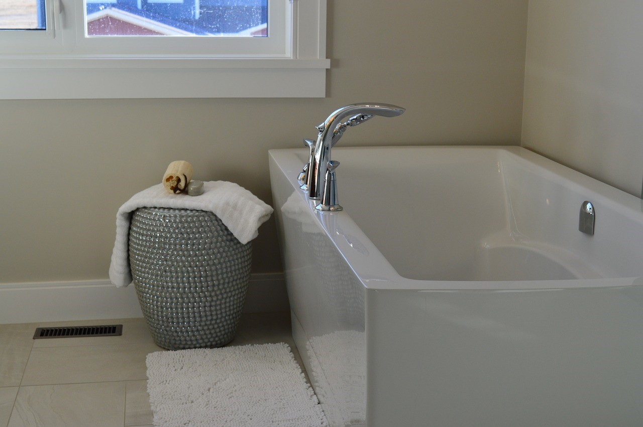
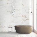
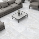
Traditionally, white’s place in the home has been limited to bathrooms due to its high levels of light-reflectivity and its association with cleanliness and purity. While white can appear cold and clinical in other areas of the house, off-whites and beige tones are always a winner for a more neutral interior design. Whether you’re looking to clad a feature wall in tiles or you’re in need of a practical bathroom splashback, we love the versatility of bevelled matt white tiles.
It doesn’t matter if you opt for a pop of bright red or bold black, clad your walls in colour to brighten up your home! Now you’re an expert on the psychology of each shade, it’s time to take a look at the tone of tile to suit you. Check out our stunning range of floor and wall tiles today to see how your interior design project can make an impact.

Comments are closed here.