

Colour Psychology: Choosing Suitable Wall Tiles for Each Space
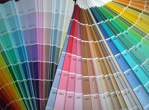
Colour plays a big part in the appearance of a room, and with each hue holding the power to affect both our moods and the overall aesthetic of an interior, finding your perfect shade can be a challenge. While we’re well aware of the connotations that come with many different colours, choose the wrong hue for a particular room and you could end up reflecting a completely different atmosphere than what was intended.
With colour thought to elicit an entire spectrum of emotional reactions, it’s no surprise that both homeowners and renters alike pour time into finding the shade that best suits each space. From choosing the most on-trend colours to picking a colour wheel that will stand the test of time, setting the atmosphere through the tones you choose will make all the difference when it comes to your home’s finished look. That’s why today, we’re taking a closer look at the power of colour, as our interior design experts explain which colours work best where – and why.
Vibrant reds for busy spaces
Red signifies urgency and energy, meaning that this colour palette is not for the faint-hearted. A brave move for some, adding a vibrant pop of red to busy domestic kitchens means that you’ll be able to feel the love in the air with this passion-evoking colour. Often used to replicate Moroccan and Arabian themes in an interior, bright red wall tiles can instantly add warmth to a room. If you’re looking to counterbalance this bold injection of colour, make the rest of the room monochrome and pair your wall tiles with black and white furnishings and flooring.
Inspiring oranges and yellows in living areas
An attention-grabbing tone that’s often thought to be less dominating than bright reds, an autumnal orange will bring something unique to any living area. Whether your interior is inspired by the Moorish tradition or is channelling the rustic rural vibe, these spicy tones will create an unforgettable aesthetic in any interior. With sleep psychologists suggesting that a bright colour scheme in sleeping areas could reduce sleep quality, inspire feelings of energy and motivation in areas elsewhere by focusing on incorporating these bold hues in living and dining rooms.
Natural greens for bedrooms and kitchens
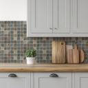
Signifying nature, health and vitality, soft greens are arguably one of the best colours to choose for bedrooms and kitchens. Reflecting the tones of unspoilt countryside, green can create a feeling of balance and harmony in an interior – and as well as improving mood, in sleeping areas, this could even enhance the quality of rest that you’re getting each night. For a space that’s truly unique, adorn a feature wall with a stunning mural made from restful olive tones, and continue the natural theme throughout the room by pairing your green kitchen tiles with a solid oak floor.
Calm blues for the bathroom
The bathroom is typically one of the smallest sections in the house, and while that means more space in living and sleeping areas, it makes it all the more important that homeowners are doing everything they can to create the illusion of space in the bathroom. Off-whites and pale blues will maximise the amount of light that is reflected around the room, so you can reduce the feeling of claustrophobia – but it’s blue’s signification of trust and tranquillity that will allow you to fully relax in this space. From light blue wall tiles to oceanic-themed artwork, decorating the space with these tones means that you can create your very own luxurious spa-like retreat.
Fresh white for smaller spaces
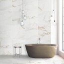
White is the ultimate shade for inspiring a feeling of space, due to its excellence in reflecting light wavelengths. For smaller spaces such as the bathroom, this makes crisp white tones a fitting choice – which is why so many interior designers are dedicated to incorporating neutral hues into a bathroom. When it comes to decorating with white tones, it’s worth considering how the colour is likely to show dirt, so maybe think about cladding the space with easy to clean floor and wall tiles. Tiles with both a matt or polished finish are easy to maintain in a domestic home, and that means you can ensure that your bathroom will always be in pristine condition, with minimal effort.
Bold blacks for elegant hallways
Black may be a staple feature in any home, but the dark nature of the colour means that it’s rarely chosen to occupy the entirety of the wall space. From pairing black with various shades of grey to creating a minimalist and monochrome interior with a mosaic of white and black wall tiles, adding drama with these tones in entrance hallways mean that you can set the standard for your interior design from the moment that you step foot through the door.
Colour says it all in interior design – and whether you opt for a pop of colour or subtler shades, the right tone in the right room will help create the atmosphere you’re aiming for.
Ready to get started? Browse our extensive collection of colourful wall tiles online, and find the hue that works for you. If you want to try a colour swatch before you buy, why not see the stunning quality of our long-lasting tiles for yourself? Order a small-cut tile sample for just 99p and we’ll deliver directly to your door.

Comments are closed here.