

What’s The Best Colour For Your Kitchen Walls?
Table of contents
Decorating your kitchen is often considered the fun part of a home improvement project, but if you don’t have a specific decor theme or colour scheme in mind, it can often be more of a headache than a heavenly experience.
Colour plays an important role in home decor, directly impacting the overall look and feel of a space. When it comes to kitchen wall colours, it’s not just the aesthetics you have to keep in mind, but also the practical aspects. After all, this is an area used on a daily basis and prone to getting messy!
So without further ado, we’re going to be running through some of the best kitchen colours that will bring an extra touch of style and practicality to your walls. Not only that, but we’ll also be sharing some ideas on how to incorporate your chosen kitchen colours into your design in different ways!

Best kitchen colours
Interior design trends continually change and this includes kitchen colours. But if you love nothing more than embracing the latest styles and hues, you’re in luck, as ‘colourful kitchens are set to be a huge trend for 2021,’ accordingly to Magnet’s Head of Merchandising, Hayley Simmons.
In no particular order, these on-trend kitchen wall colours include:
- Green – sage, mint, olive and avocado
- Blue – navy, turquoise, sky and royal blue
- Warm red – burgundy, ruby, berry
- Yellow – sunshine, mustard, pale lemon
- Pink – blush, rose, candy floss, bubblegum
- Grey – light grey, dove, slate and charcoal
- White
- Black
Greens
Conjuring up connections to nature and a sense of tranquility, green walls can be a soothing kitchen colour – ideal for busy households.
Having gained popularity since early 2020, green kitchens (which includes green cabinets) are continuing to be a mainstay for the foreseeable, and with such a diverse choice of shades, it’s no surprise.
For a subtle injection of green, pale and cool hues like mint, pistachio and sage green could be just the ticket as a kitchen wall colour, while darker tones like olive and pine are ideal if you want lashings of drama.
Styling ideas
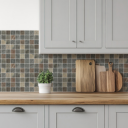
When it comes to covering your kitchen walls, the obvious areas in need of colour (and protection) will be splashbacks above worktops. Green offers both style and practicality for this area. Unlike paler shades of white, cream and grey, green can mask many of those everyday marks from daily use.
The best option for splashbacks would be tiles, perfectly poised to repel water from sinks and other splashes that come their way.
For a funky retro vibe, green metro tiles finished with white grout could be the perfect combination to elevate your walls from bland to beautiful. If you prefer a more rustic look, crackle glazed green tiles in various shades add texture and interest.
For statement splashbacks, unconventional shapes and designs could be the way to go instead, like the Arrow tiles collection or Pulse range. With the option to lay them in various patterns, these green tiles demand to be noticed, all while giving your kitchen walls a chic finish.
For other areas of the kitchen, paint is the way to go. And if you prefer to keep your cabinets and splashbacks neutral, using coloured walls surrounding these core elements can be all that’s needed. For instance, a pale sage or olive green against a cream or white kitchen design will instantly transform the space into a vibrant cooking hub.
Whichever green hues you choose for your kitchen wall colours, pair them with light neutral palettes such as off-white, pale beige or creams to create the right balance of colours. This can also strengthen the tie with nature, making your kitchen feel like an inside oasis.
Blues
Blue has also been ramping up its appearances as a go-to kitchen colour. Like green, it brings with it a sense of freshness and serenity, not to mention an element of fun if you opt for bolder shades.
‘The more sophisticated and dramatic colour choice when it comes to kitchens, midnight blue has been an emerging trend recently,’ explains Iain McColgan, Director of Showrooms at B&Q.
This love affair with navy from 2020 is set to continue, but for many this trend focuses on cabinetry rather than kitchen walls. However, that’s not to say you can’t buck the trend, starting your own navy movement and opting for dramatic kitchen walls instead.
Other popular blue tones for kitchen wall colours include soothing pastel blues, turquoise and royal blue for a vibrant pop of colour.
Styling ideas:
As with most strong colours, blue is best offset against paler tones like cream. However, if you want a striking finish, why not go bold and team it up with some terracotta shades or flourishes of a blush pink?
As a kitchen splashback colour, blue brings bags of character to this typically functional feature. For a calming feel, play around with soft pastel blues. This could be single-coloured blue tiles or, for a more playful aesthetic, you could even indulge in some pretty patterned tiles with blue designs.
Beyond kitchen splashbacks, painted blue walls can also be an effective way to inject some colour into your kitchen. To optimise the impact of your chosen wall colour, try to use similar shades of blue in different textures and materials like kitchen accessories and hardware to tie the whole theme together.
Warm reds
“In challenging times, we crave warm tones that will enrich our homes and create cosy sanctuaries away from the outside world,” says Joa Studholme from Farrow & Ball.
This is perhaps why we’re seeing a lot more red creeping into kitchen colours, dishing up a serving of pure comfort and relaxation. While this may not be what you typically associate with kitchens, as these areas become more multi-functional their design needs to look beyond its primary function.
Tones like burgundy, mulberry and ruby red are an ideal choice if you want your kitchen to look and feel different from the everyday. By their nature, these warming hues instantly conjure up feelings of luxury and indulgence and likely work best with a contemporary style kitchen.
Styling ideas:
Rich reds are perfect for bringing interest to typically bland white and cream kitchens. As a kitchen splashback colour, they can also be very forgiving when it comes to concealing dirt, grease and grime (that’s not to say you shouldn’t regularly wipe them off though!).
These colours can also work well with dark grey and green if you want your kitchen to feel brooding and packed with atmosphere. Dark red tiles like those in the Stromboli collection are primed to deliver a sleek and sophisticated finish and can be laid in a range of patterns to make them even more of a statement piece, from bricklay to herringbone.
If red tiles aren’t your thing, look to larger wall areas to bring this eye-catching kitchen colour into the mix. This could be a warm red feature wall finished with your favourite artwork or even some patterned wallpaper with warm red designs running through them – the possibilities are endless.
Yellows
When Pantone announced ‘Illuminating’ yellow as one of its colours of 2021, you can only imagine it took the interior design world by storm, featuring in every room of the house. And when we’re talking about kitchen wall colours, yellow can be the perfect accompaniment.
Packed full of vibrancy and fun, yellow’s association with sun, happiness and creativity could be all your kitchen needs to shine. Naturally it’s one of the louder colours, so we’d suggest applying it in moderation rather than a full-scale yellow bonanza on your walls.
Styling ideas:
White and yellow are a match made in heaven, so if your kitchen design has a white base colour, introducing yellow shouldn’t be too tricky.
When styling, yellow should be your accent colour and used in various settings to tie everything together. This could manifest itself as pale yellow walls that beautifully frame your white kitchen cabinets. Finishing with pops of deeper yellow for kitchen accessories will heighten the sunny feel throughout the entire space.
Alternatively, use kitchen splashback colours to project that element of fun. Funky Naples Hex tiles deftly echo yellow’s playful side to deliver a modern touch, while metro tiles in softer yellow tones can perfectly convey a more traditional feel.
Pinks
In recent years we’ve seen pink mature into a grown up colour that has rightfully earned its place in our homes. For kitchen wall colours it’s probably not everyone’s first choice, but for those looking for on-trend kitchen design, it could be the way to go.
Rose and blush pinks are proving to be popular options, mostly likely because they aren’t too overwhelming and sit beautifully alongside a wide range of other colours. For instance, navy and pale pink go together like strawberries and cream, and the same can be said for pink and grey – giving kitchens a strong palette that feels bang up to date.
Styling ideas:
Like yellow, pink is probably best used as an accent colour alongside another shade – otherwise you run the risk of your kitchen feeling like something out of Barbie’s Dreamhouse!
A great way to bring pink into your kitchen design is using pink splashback tiles that not only add colour, but also texture and depth, especially if you opt for a 3D tile design.
Laying pink splashback tiles in less conventional patterns like chevron or herringbone can position them as a mature, considered feature in your design rather than something that belongs in a child’s bedroom.
Where paint is concerned, choosing a fresh, crisp pink for walls can breathe a whole new life into your kitchen design. If you’re forgoing bulky cabinets or opting for a more open kitchen design, tile up to shoulder height then finish the walls with pink paint to create a layered look that’s brimming with textures.
Greys
While grey has taken a bit of a back seat over the past year as a go-to kitchen colour, it still earns a rightful place as one of the best kitchen colours. Not only does it offer an endless selection of shades, it also boasts outstanding versatility as a kitchen colour as it has the ability to seamlessly sit alongside so many different colours.
Delivering classic elegant interiors, grey kitchens tick the box for timeless kitchen interior design. Whether you go for moody dark greys set against white or something more playful like a pale grey paired with a rosy pink, the end result will be a kitchen colour that you never seem to tire of.
Styling ideas:
In terms of incorporating grey into your kitchen colours, there are bags of potential to use it on your walls.
To bring a sense of calm to chaotic kitchens, use pale, muted tones for kitchen splashback tiles. Firstly they’ll conceal those pesky spaghetti splatters with ease, but secondly they’ll effortlessly bring with a sophisticated and sleek look.
For a clean and pared back touch, light grey, large format tiles with a stone-effect finish could be the way to go. The stone design will bring texture and depth, while the colour palette will ensure it’s not too overwhelming. You can then use coloured accents or different material like brass, wood or copper to lift the aesthetic.
When it comes to painting your kitchen walls, grey offers so many options.
For a dramatic look, opt for a dark, moody colour on one wall. If you’re using another bold colour, make sure you go for a grey that will strike the right balance between the two. And don’t forget: if you don’t fancy grey walls, you can use accents like bar stools, kitchen appliances and decorative touches to capture a grey essence instead.
Whites
All-white kitchens reigned supreme for a long time a few years ago, but in recent years there’s been a craving for colour in our homes instead. However, as a kitchen colour, white and it’s close relations cream remain a popular choice.
Newer takes on white kitchens tend to use it more as a dominant base colour that’s blended with other shades to add interest, which is all part of its appeal as a kitchen colour. All of these lighter palettes stand the test of time well and are easily adaptable, giving you endless possibilities to marry it up with other colours in your kitchen decor.
One of the biggest benefits of using white as a kitchen colour is its ability to make even modest kitchens feel light and airy.
Styling ideas:
In terms of using white as a kitchen wall colour, the obvious choice is to white-wash every wall. Certainly if you’re using coloured cabinetry it can help to tone and balance bold colours, creating a light and airy ambiance. Also, if you’re worried all-white walls will lack personality, pick a few colourful accents to use for decorative pieces and soft textures throughout the space that will ensure it feels homely.
When it comes to using white or cream kitchen splashback tiles, these colours work beautifully to offset dark worktops or cupboards. This is especially true if you opt for a shade of white tiles that has a glossy finish that bounces light around the room. You can also use bevelled edges like those on white metro tiles, or tiles with a 3D design that will reflect even more light at different angles.
Blacks
If you want to bring drama into your cooking space, then a black kitchen could be the way to go. However, most contemporary kitchen interiors centre around using black kitchen units rather than on the walls.
That’s not to say you can’t use it on your walls though, as it definitely has a lot of practical benefits as far as kitchen colours go.
The key with using black though is to ensure it’s well-balanced with a lighter shade so it doesn’t feel too oppressive. Similarly, this is a colour that tends to work better in larger kitchens.
Styling ideas:
One clever way to bring black hues into your kitchen is to pair it with white cabinets. This classic colour combination delivers enviable style with stark contrasts. For a funky, retro look opt for glossy black metro kitchen tiles finished with white grout to really make them stand out.
Alternatively, black matt shell-shaped tiles will project an elegant and sleek finish with oodles of texture.
It’s also possible to use black paint on the walls, but as with any bold colour, less is more and it needs to be balanced with a lighter shade. One fun idea could be to create a giant blackboard wall, using blackboard paint and chalks to write messages on – ideal if you have creative little ones running around.
There’s no doubt that choosing the right kitchen colours for your walls can be challenging, but hopefully this guide has given you plenty of inspiration to help you figure out just the right colour for you.
Of course, if you need any further ideas for kitchen splashback tile colours, check out our extensive kitchen tiles range that boasts a broad spectrum of colour options as well as different finishes, shapes and styles. And once you’re confident you’re ready to take the plunge, be sure to check out our blog post on how to tile a kitchen without any costly mishaps!

Comments are closed here.